


A supplier scorecard converts supplier performance into a single, auditable score built from five categories: quality, delivery, cost, service, and compliance. Most procurement teams get better results by scoring 3 to 5 KPIs per supplier rather than tracking everything measurable. The next step is simple: pick your KPIs, write down exactly how each one is calculated, and name the system that will supply the data.
TL;DR:
- Critical suppliers require a focus on delivery and quality metrics, with thresholds set at 95% OTIF and 200 PPM for safety-critical parts.
- Most metrics should be scored on a normalized scale and weighted according to supplier criticality, with hard thresholds triggering automatic containment actions.
- Data sources include the Quality Management System for quality, ERP for delivery, and procure-to-pay systems for cost, updated on a cadence aligned with potential risk escalation.
- Tier 1 suppliers need comprehensive, monthly scorecards with dedicated owners, while lower tiers require simpler, less frequent reviews focused on key metrics.
- Starting with your top 10 suppliers, validate data manually for 30 days, and avoid overly complex scorecards to ensure effective supplier risk prediction.
Table of Contents
- What Are the Core Supplier Scorecard Metrics?
- How Do You Score and Weight Supplier KPIs?
- Where Should Scorecard Data Come From, and How Often Should It Update?
- How Should You Tier Suppliers for Scorecard Governance?
- What Does a Working Scorecard Template Look Like?
- How Do High-Volume Precision Manufacturers Apply Scorecard Discipline?
- A Practical Checklist to Get a Scorecard Running in 90 Days
- Sources
What Are the Core Supplier Scorecard Metrics?
Every workable scorecard rests on a small set of metrics that behave the same way no matter which industry you’re in. The trouble most teams run into isn’t a lack of data. It’s inconsistent formulas that make month-to-month comparisons meaningless.
Quality starts with Parts Per Million defective (PPM), calculated as (defective units ÷ total units shipped) × 1,000,000. A supplier shipping 30,000 parts with 6 rejects runs at 200 PPM. Process capability index (Cpk) measures how consistently a supplier’s process stays within tolerance, with 1.33 generally considered the floor for critical dimensions and 1.67 preferred for aerospace-grade tolerances. First Pass Yield (FPY), the percentage of units that clear inspection without rework, rounds out the quality picture.
Delivery centers on On-Time-In-Full (OTIF), the percentage of orders delivered on the promised date at the promised quantity. World-class manufacturers target OTIF at 95% or higher, with anything below 85% typically flagged for containment. On-Time Delivery (OTD) is a looser cousin of OTIF that ignores quantity accuracy, so don’t let vendors substitute one for the other in a report.
Cost goes beyond unit price. Invoice accuracy (percentage of invoices matching the purchase order without discrepancy) exposes billing friction fast. Total Cost of Ownership (TCO) layers in freight, tooling amortization, scrap replacement, and warranty claims on top of piece price, which is why a supplier with the lowest quote often loses on TCO once rework and expedite fees enter the math.
Service and compliance round out the set:
- Responsiveness: average hours to acknowledge a purchase order or respond to a quality escalation
- Communication quality: percentage of proactive notifications (delays, shortages) versus reactive discoveries
- Compliance/ESG: certification status (ISO 9001, AS9100, ITAR where applicable), audit findings closed on time, and labor/environmental attestations
Each metric ties directly to risk. A PPM spike on a safety-critical part can cause significant operational disruption. A slipping OTIF percentage cascades into your own on-time promises. Reviewing on-time delivery benchmarks alongside quality data, rather than in isolation, is what separates a scorecard that predicts trouble from one that just documents it after the fact.
How Do You Score and Weight Supplier KPIs?
Raw metrics live in different units, PPM in parts per million, OTIF in percent, invoice accuracy in percent, so you need a common scale before you can combine them into one number. Most teams pick either a 1 to 5 scale or a 0 to 100 scale and map each KPI’s actual performance onto it using defined bands (for example, OTIF ≥ 98% = 5, 95 to 97.9% = 4, 90 to 94.9% = 3, and so on).
Weighting comes next, and it should reflect what actually breaks your business:
- Critical suppliers (sole-source, safety parts, long lead times): Delivery 40%, Quality 30 to 40%, Cost 15 to 20%, Service 10 to 15%
- Commodity suppliers (multiple sources, low switching cost): Cost typically rises to 30 to 40%, with Quality and Delivery splitting the remainder
- Regulated or pharma-adjacent suppliers: Quality weight often climbs above 40%, per common industry weighting frameworks
Weighting alone isn’t enough. A supplier can post a strong composite score of 4.2 out of 5 while quietly failing on a single dimension that matters more than the average suggests. That’s why scorecards need hard-threshold overrides: PPM above 500 or OTIF below 85% should trigger automatic containment and a corrective action, regardless of what the composite score says.
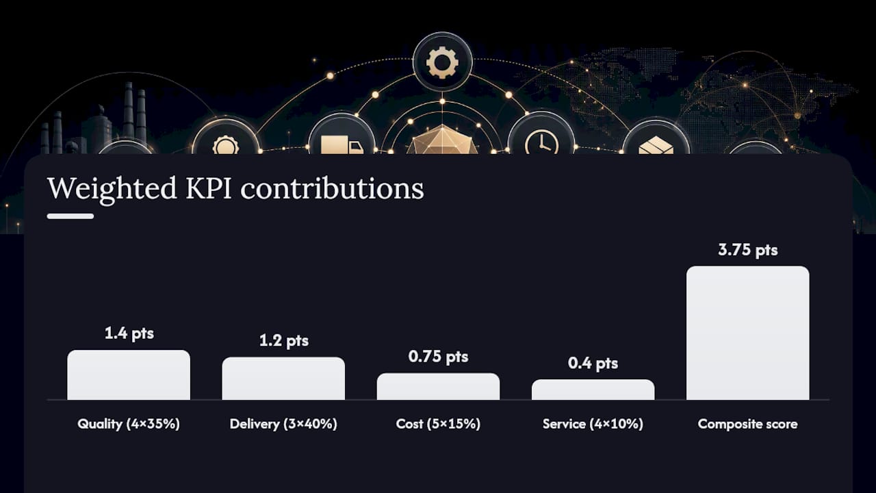
Here’s a worked example. Composite = (4×0.35) + (3×0.40) + (5×0.15) + (4×0.10) = 1.4 + 1.2 + 0.75 + 0.4 = 3.75 out of 5, landing in an Amber RAG band (typically 3.0 to 3.9).
Where Should Scorecard Data Come From, and How Often Should It Update?
Scorecards fail for one boring reason more than any other: nobody agreed which system owns which number. Fix that first and the rest gets easier.
- Quality data (PPM, Cpk, FPY): pulled from your Quality Management System (QMS) and inspection records, including CMM and SPC data logged at receiving
- Delivery data (OTIF, OTD, lead-time variance): pulled from ERP goods-receipt timestamps against original PO promise dates, never from supplier-reported ship dates
- Cost data (invoice accuracy, TCO components): pulled from your procure-to-pay (P2P) system, matching invoice lines against purchase orders
- Service and compliance data: a mix of supplier-portal records for certifications and structured stakeholder surveys, since responsiveness and communication quality can’t be pulled from a database
Cadence should match how fast a problem can compound. Delivery and quality exceptions deserve real-time or daily alerts. Cost and invoice accuracy work fine on a weekly cycle. Service surveys and ESG documentation belong on a quarterly rhythm, since chasing that data more often just wastes stakeholder goodwill. Organizations that automate this pipeline, rather than relying on manual quarterly reviews, cut supply chain disruptions by a measurable margin, largely because exceptions surface in days instead of months.
Pro Tip: Before automating anything, run a 30-day manual validation where you pull each KPI from its intended source and compare it against what the supplier reports. Discrepancies here almost always point to a broken data mapping, not a supplier lying to you.
How Should You Tier Suppliers for Scorecard Governance?
Not every vendor needs the full battery of KPIs. Tiering by spend and criticality keeps the program from collapsing under its own weight.
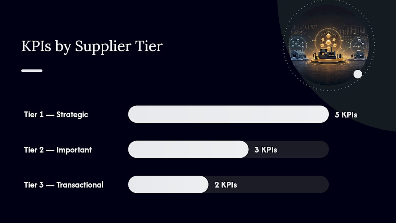
- Tier 1 (strategic/critical): sole-source suppliers, safety-critical parts, or spend above a set threshold get the full scorecard, all five categories, monthly scoring, and a named commercial owner
- Tier 2 (important): multi-source suppliers with moderate spend get a reduced set, typically Quality, Delivery, and Cost, reviewed quarterly
- Tier 3 (transactional/commodity): low-spend, easily-replaced suppliers get a minimal set, often just OTIF and a basic quality flag, reviewed annually or on exception only
Escalation needs the same clarity as scoring. A single missed OTIF target might just generate a note in the supplier’s file. A hard-threshold breach (PPM over 500, OTIF under 85%, or a failed audit) should trigger a formal Supplier Corrective Action Request (SCAR) with a named owner and a fixed response window, usually 5 to 10 business days for containment and 30 to 60 for root-cause closure. Three consecutive periods of decline, even without breaching a hard threshold, should raise more concern than a single bad month, because trend direction predicts failure better than any single snapshot.
Governance cadence follows a simple rhythm: daily exception monitoring for delivery and quality flags, weekly tactical reviews between buyers and supplier quality engineers, monthly operational reviews at the category manager level, and quarterly strategic reviews where Tier 1 relationships get renegotiated or requalified based on trailing scorecard data.
What Does a Working Scorecard Template Look Like?
A one-page scorecard should be simple enough that a category manager can read it in under a minute and know exactly what to do next.
| Field | Definition | Example value |
|---|---|---|
| Supplier / Part family | Name and scope of the scorecard | Precision Turned Components Inc. |
| Quality score (PPM/Cpk) | Weighted score from PPM and Cpk inputs | 200 PPM → score 4/5 |
| Delivery score (OTIF) | Percentage of orders on-time and in-full | 95% OTIF → score 4/5 |
| Cost score (invoice accuracy) | Percentage of invoices matching PO without discrepancy | 97% accuracy → score 5/5 |
| Composite weighted score | Sum of category scores × assigned weights | 3.75 / 5 |
| RAG status | Red/Amber/Green band from composite and hard thresholds | Amber |
| Owner | Named person accountable for the relationship | Category Manager, Turned Parts |
| Next action | Specific corrective step and due date | Root-cause OTIF miss by [date] |
Adapt the template two ways depending on scope. A supplier-level scorecard aggregates every part number that supplier ships to you, which works for commercial reviews and requalification decisions. A part-family scorecard narrows to a single component group, useful when one product line is driving quality escalations that would otherwise get diluted in an aggregate supplier score. Most Tier 1 relationships benefit from running both side by side.
How Do High-Volume Precision Manufacturers Apply Scorecard Discipline?
Running a 70,000 square foot facility with automated Hydromat systems, CNC milling and turning, and wire EDM producing more than 20 million parts a year means Machiningtechllc lives or dies by the same PPM and OTIF numbers this guide describes, just at a scale where a small drift compounds fast.
- PPM thresholds below 50 for safety-critical firearm and aerospace components, with tighter Cpk requirements (1.5+) on tight-tolerance features
- Inspection cadence built around in-process SPC checks rather than end-of-run sampling, catching drift before a full batch ships
- A real SCAR pattern: a spike in a specific bore diameter flagged by receiving inspection data triggered a containment hold, root-cause traced to tool wear drift, corrected within a defined closure window, and verified with a follow-up capability study
Reviewing quality control practices built for manufacturing teams shows how inspection cadence and PPM discipline scale from a single work cell to a full production floor.
A Practical Checklist to Get a Scorecard Running in 90 Days
Start with your top 10 suppliers by spend, pick 3 KPIs each, and run a 30-day data validation before scoring anything for real. Assign one owner, one review cadence, and one corrective-action rule per supplier. Avoid the traps that kill most scorecard programs: too many metrics, targets set before you have a baseline, and composite scores that hide a bad trend line.
— Andrew
Sources
For deeper benchmarking data and methodology, review Ivalua’s supplier scorecard framework, Leanlinking’s OTIF and PPM automation guide, and Certainty Software’s benchmarking approach.
Building scorecards that actually predict supplier risk, rather than just documenting past failures, often comes down to who is supplying your parts in the first place. Teams sourcing high-volume, tight-tolerance components can see how contract machining partnerships accelerate production timelines while keeping the PPM and OTIF numbers a scorecard depends on where they need to be.
- Supplier Performance Scorecard: Automate OTIF & PPM Metrics — Leanlinking
- Supplier Scorecards: How to Benchmark Supplier Reliability, Quality & ESG – Certainty Software
- Getting Supplier Scorecard Metrics Right: A Quick Guide — GEP